Create a World-Class Logo with these 6 Branding Principles

Branding plays an important role in our capitalistic society. It takes a product or service and transcends it beyond its features and specifications into something that consumers form an emotional bond over. This bond leads to consumer loyalty, defending and endorsing brands, and a willingness to pay more solely for the brand.
Apple has evolved an entire industry based on their branding. By merging software development and hardware design, they created a competitive advantage. Their brand strategy is used as case studies in business classes around the world. The value of the Apple brand is staggering.
Tim Hortons is another prime example of the impact of branding on a corporation. Although consumers have varying taste preferences when it comes to hot drinks, sandwiches, and baked goods, Tim Hortons has built a brand around fresh, quality, affordable products in an inclusive environment. Over the years, this inviting branding has created a strong community of daily Tim Hortons customers. The coffee shop continues to pull in new customers through popular promotions, such as “Roll Up the Rim to Win”, and community support programs like Timbits Hockey. Coffee is a commodity, but Tim Hortons has managed to build a loyal fan base through consistent branding.
So how can your company build its brand? It starts with the primary pillar of your business’ branding: your logo. This article will dive into six principles your business can use to develop a logo that is effective, as well as synonymous with your business and its culture.
1. Make Sure Your Logo Translates to Grayscale
Businesses should use their logo everywhere to maximize its exposure and build a bond between your corporation and what it means to your customers and prospects. Sometimes you’ll have the benefit of full colour advertisements, however keep in mind that there will be times that you are restricted to grayscale or even one colour. Your logo should use white space, high contrast colours, and an overall shape that translates well to both dark and light backgrounds.
2. Choose Colours that Establish Your Brand Image

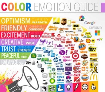
The importance of your logo’s colours cannot be understated. Colours mean different things to different people, so make sure that you are sensitive to what colours signify in your industry. Accountants may not like the colour red because it signifies debt, however if you are selling food or cars, this colour tends to instil excitement and power in those target audiences. Health foods often use green as it signifies peace, growth, and health, but relate to wealth in the financial industry. Do some research on how your target audience perceives colours and take advantage of the colours that represent your brand image.
Also take a look at your competition and make sure that your logo colours are different. Having similar branding colours to your competition isn’t going to help you stand out as a brand leader.
3. It’s Not Just What You Say, It’s the Font You Say It In
Similar to logo colour, your font should be used in at least some of your business’ written content, so make sure it matches your brand’s image. Serif fonts, such as Times New Roman, portray a professional, serious tone, whereas sans serif font, such as Arial or Helvetica, have a more neutral or casual connotation. Thus, sans serif might not be the best choice for a children’s toy and serif may be avoided by some lawyers who prefer the conservative image that san serif provides.
4. Select Supporting Brand Colours if the Logo Only Contains 1-2
Some of the world’s largest corporations have logos that consist of only one or two colours, which can be restrictive when it comes to marketing collateral design. By adding additional colours into your brand identity, you open up your design capabilities beyond the base logo colours. Your design team will thank you.
Choose supporting branding colours that you can use alongside your primary logo colours in your advertisements, letterheads, and other collateral that complements and contrasts your primary brand colours.
For example, if your logo is yellow, you may want to consider a darker supporting brand colour and if your logo is a dark grey, you may want to consider a vibrant colour to offset it.
5. Incorporate Text or Create a Text-Inclusive Version of the Logo
 By incorporating your brand name in your logo, you increase the exposure of your brand name every time your logo is shown. Small businesses can find this especially useful as they strive to for brand exposure and knowledge. Clever manipulation of text in your logo can also give it more personality, such as FedEx’s arrow hiding between the “E” and “x”, signifying a direct path and process for FedEx’s packages. Text doesn’t have to stunt your creativity; use it to your advantage and you may build fans based solely on your creative typography.
6. Consider Logo Variations for Product Lines
Branding consistency across product lines is a powerful asset. While developing your corporate logo, consider designing a logo that can be tweaked slightly for various product lines. Microsoft has done an excellent job of this with their Office 2013 & 2016 branding. The various Office product logos complement one another by using the same basic layout and modifying each version slightly to represent the product offering.
Use Your Logo Everywhere!
Once you’ve created various iterations of your logo and decided on a final version, it’s time to deploy it in every corporate channel in your business. Brand exposure is critical. It may take some time, but your logo will become synonymous with your brand and company. Also, don’t be afraid to change or update your logo. Consumer behaviour is constantly evolving and it’s not uncommon for companies to re-brand to satisfy and target the needs and wants of their target audience. If you just designed a logo, feel free to link to it in the comments. We would really like to see it!
Recent Strategic Marketing Blogs:


Great tips on logo branding for small businesses! A strong brand identity is essential for success.